|
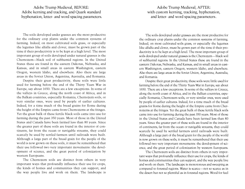
Client: In-house. 1999. Adobe Trump Medieval, before and after. I use Trump as my own house typeface, for all my business communications and a wide variety of personal projects. I chose Trump for its straightforward but not plain look, and good legibility even at lower resolutions. As often happens, the foundry didn’t do a very thorough job of kerning the font (adjusting the space between all pairs of letters that occur in actual use), which is why Trump isn’t often used, despite its excellent design. I kerned it, tracked it (customizing parameters for the font so that the overall letterspacing would remain proportionate at all type sizes), and developed optimal hyphenate-and-justify parameters so that it would look its best in justified text. I had to do an exceptionally thorough job, since I need, of course, to turn out business communications reflecting the highest typographic standards, and don’t want to have to stop and tweak the typography while I’m doing it. I also need to produce text that looks good not only in English, but in the other languages I also set frequently—which involves accented characters, and a wider range of kern pairs. This sample is best seen printed out. To view and download it in PDF format, click here. |